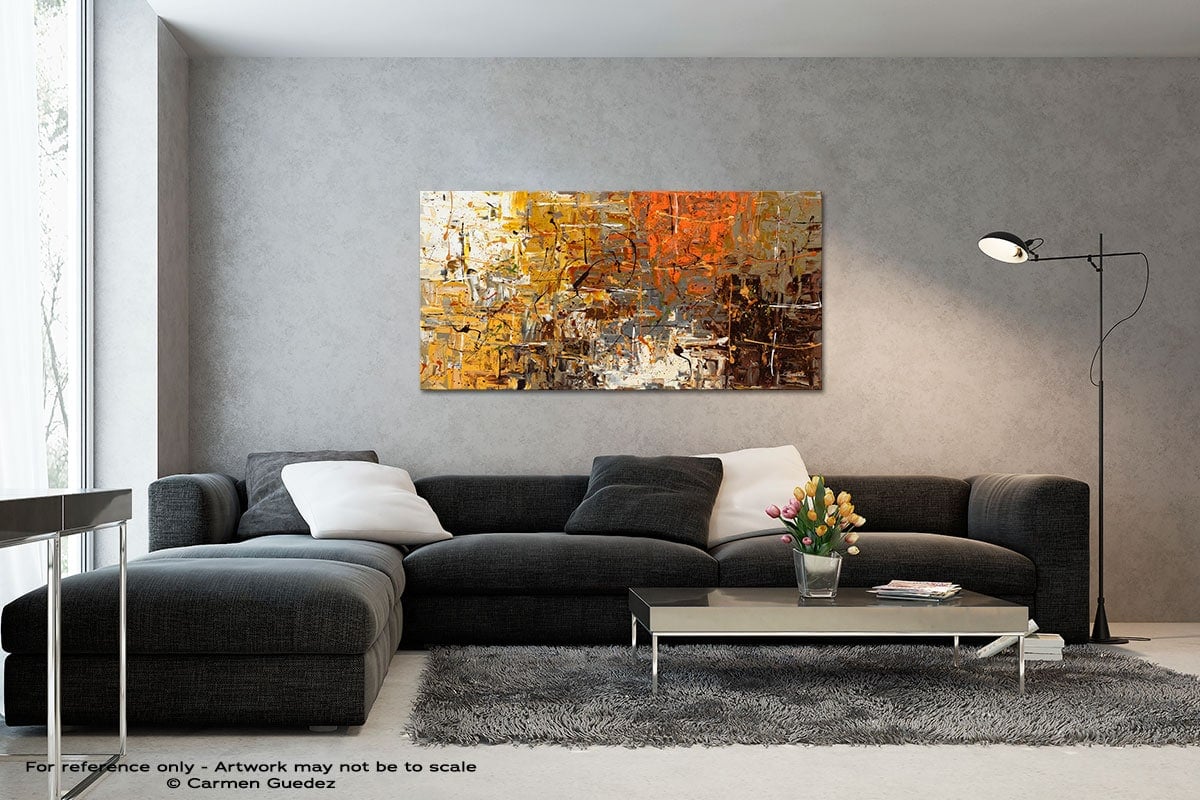
Art Trends and Color in Abstract Art
Quick Summary: Abstract art can celebrate color in a way few other styles can. That is why color trends can affect it so strongly. When we look out at the coming year, we have a few ways to predict what will come. We look at Pantone’s color of the year to trends in art sales to find what modern abstract art will embrace over 2021. And finally, we’ll look at what color trends mean in today’s diverse world.
Abstract art will always change in response to our culture. And as interior designers and our culture follow new styles and color trends, so too will abstract art.
Because color is such a foundational element of abstract art, especially painting, it is a genre sensitive to color trends. To understand how color will change over 2021, we can get a sense of how abstract art will change.
But how can we predict the near future of color? We’ll start with the thought leaders in the field and then look into specific color trends to get a closer look at what’s to come.
Pantone Color of the Year
PANTONE 17-5104 Ultimate Gray + PANTONE 13-0647 Illuminating, two independent colors that highlight how different elements come together to support one another, best express the mood for Pantone Color of the Year 2021. Practical and rock solid but at the same time warming and optimistic, the union of PANTONE 17-5104 Ultimate Gray + PANTONE 13-0647 Illuminating is one of strength and positivity. It is a story of color that encapsulates deeper feelings of thoughtfulness with the promise of something sunny and friendly. — Pantone
One of the best indicators for where abstract painting color trends will go is by listening to the institution that sets the most influential color for the year.
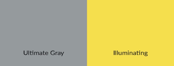
Pantone Color Institute announces a color of the year in a tradition going back to 2000. Combining representatives from several nations, they hold secret meetings to discuss what colors capture the feeling in the air. Their announcement can make a large impact on graphic design, fashion, and visual arts.
After the difficult year of 2020, Pantone must have known we needed a lot, because for the second time ever they chose two colors. A middle-gray (what they call Ultimate Gray) and a bright, optimistic yellow (what they call Illuminating).
When used together, these deliver both stability and warmth, security and friendliness. Two things we could all use more of in the coming year.
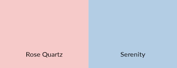
2016 was the only other year that they chose two colors: Rose Quartz (a fleshy pink) and Serenity (a soft blue). These were picked to represent the growing awareness of the fluidity of gender.
But there is a question still unanswered, “How much does the Pantone Color of the Year affect art?”
Well, that’s not as easy to answer as it might seem. Certainly, it can have an impact on graphic design. As these colors sift into more and more of the popular culture, the color antenna of the artist is certain to pick up on it and put it to use. But that is a general, slow process.
Because of their popularity, the Pantone Color of the Year can also be a self-fulfilling prophecy. If Pantone says that yellow and grey are the colors of the year, so many people might listen that they become the dominant colors.
Maybe it is better to use the reasoning behind Pantone’s choice. After the arrival of the Covid-19 vaccine and the end of a very difficult year, Pantone predicts that people will yearn for a return of hope and feelings of security.
Abstract artists will no doubt be communicating these sentiments, whatever colors they choose. And they would be well served to use grey and yellow for these purposes.
Let’s go through the most popular color trends in abstract art:
Black and White Abstract Art
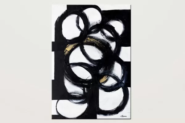
Collective Minds – Minimalist Large Abstract Art
- Custom Order
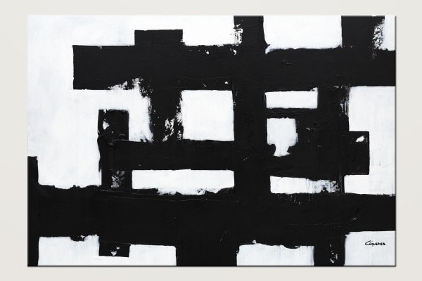
Straightforward – Abstract Art in Black and White
- Custom Order
Great abstract artists like Franz Kline have shown just how powerful black and white abstract art can be. Apparently spurred on by the suggestion of none other than Willem de Kooning, Kline began developing with his trademark style in the late 40’s — and he changed abstract art forever with his bold black lines and stark white backgrounds.
Kline’s large abstract wall art abandoned the wild experimentation in color that defined an earlier generation of artists in the field. His work stands as a testament to the ability for simple black and white to excite and engage the viewer.
But how will this kind of work fare going forward?
His famous black and white paintings still command massive figures at auction, but over the last decades, these have diminished. But does a single artist market, even for an artist as eminent as Kline, really dictate an entire color scheme?
Despite these trends at the top of the market, it appears that black and white paintings are popular among buyers right now. These paintings have a way of working with so many different decors, and they bring a sophisticated energy to a room. It seems that the art market as a whole is loving black and white abstract art, and they will likely continue through 2021.
What’s more, it seems that black and white abstract art is trending in interior design circles. You can’t scroll through Pinterest or Instagram right now without running into it. That is a promising sign for artists who work in the style.
In particular vogue are large canvas art in these colors. The combination of a work of art that takes up a lot of space but doesn’t drop several hues into the mix is attractive for several reasons. First among them, black and white abstract painting fits in with a modern aesthetic. These paintings are sleek and smart. And depending on the composition, they can just as easily bring lots of energy as they can soothe and calm a space.
That buyer-friendly appeal will continue to drive sales of black and white abstract art, even if the next Kline only sells for four million dollars.
Blue Abstract Art
Translated into dollar values, the extra edge afforded by blue and red hues was substantial. Schneider notes that for every standard-deviation increase in blue, prices jumped by around $53,600. Comparatively, red paintings enjoyed a nearly $21,200 price boost for every standard-deviation increase in color. — Meilan Smolly for Smithsonian Magazine
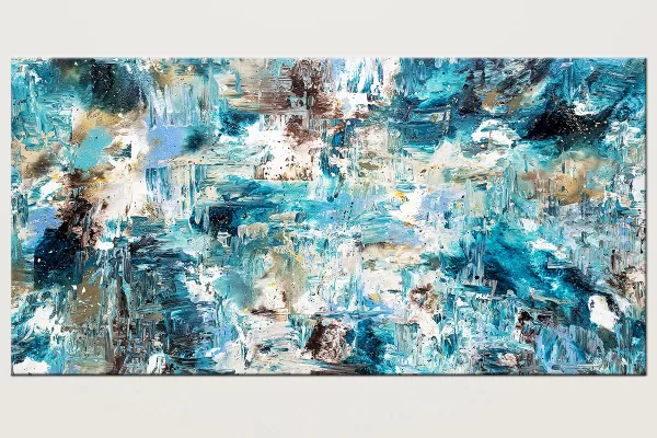
Coral Reef – Extra Large Blue Abstract Painting
- Custom Order
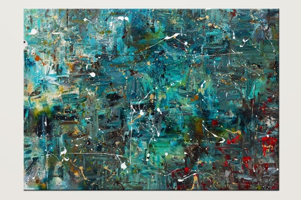
Go For it – Modern Abstract Art in Blue and Teal
- Custom Order
Art, like everything else, has a business side. Artists who like to feed themselves will not ignore the market. And there seems to be a pretty stable feature in abstract wall art: blue sells.
How do we know this? Researchers from the CentERlab at Tilburg (Marshall Ma, Charles N. Noussair, and Luc Renneboog) combed through the massive Blouin Art Sales Index. They tracked 5,500 abstract works of art sold at auction from 1994 to 2017. They narrowed their focus by removing any works with geometric patterns, unusual canvas shapes, and even figuration.
In this group of predominantly abstract expressionist pieces, they found the more blue a painting had, the more its price increased above the average.
That’s good news for artists who work with the color, and it is also interesting information for art collectors with a few blue abstract paintings on their walls.
But the question of why still remains. Maybe it is the effect of cool colors on our minds, giving us a sense of calm. For artwork in the home, that seems to be a highly desired feature. The power of blue to relax our minds and bring us peace will always be a powerful argument for the continued popularity of the color in abstract art.
And for large blue abstract art, the effects combine with the general increase in price based on size. So it is clear that big canvases with lots of blue are likely to be valuable works.
SIDENOTE: While Pantone might be focused on grey and yellow for their stability and optimism in the coming year, it also seems that the power of blue will appeal to buyers as well. There will no doubt be rocky months ahead as we enter 2021. A good time for serene blue hues.
Red Abstract Art
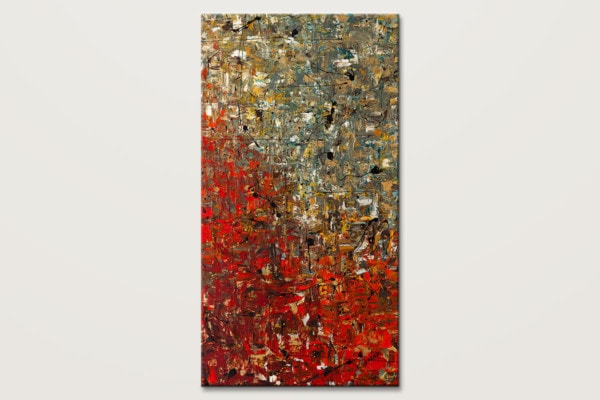
La Fontaine – Extra Large Abstract Art Painting
- Custom Order
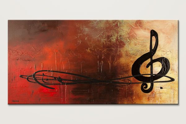
The Pause – Original Abstract Art Painting
- Custom Order
In the same study mentioned above, researchers found that red also makes for higher returns at auction, though the effect is not quite as pronounced as blue.
Because red is so engaging, there will likely never be shortage of it on abstract canvases. And while it isn’t highlighted in many 2021 forecasts, partly that’s because it doesn’t need to be. Red has a perennial appeal, never going out of style.
Red creates feelings of power, aggression, and emotional arousal on all levels. That makes it difficult to imagine the world of art without it. Nothing brings a room to life like a large red painting. Even color field paintings of red manage to capture the viewer and bring them to life. The color alone is enough to wake us up.
These enduring features make red immune to the rise and fall of trend. For abstract art collectors, pieces are typically needed to speak to our lives beyond the season or the year. Buyers are looking for works of art that will stay relevant for the long haul. That means they do well to listen to their instinct and buy red wall art.
BOTTOM LINE: While it might not be a year where a lot of red abstract art is created, it will still sell. And while it might not fit in with all the latest interior design trends, it will remain important through 2021 and far beyond.
Minimalist Abstract Art
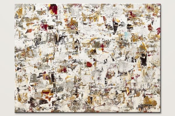
Blaze of Glory – Minimalist Abstract Painting
- Custom Order
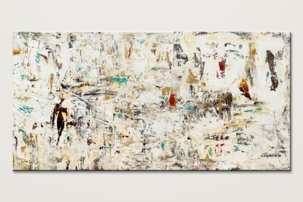
Quest – Minimalist Abstract Wall Art Painting
- Custom Order
Minimalist art seems to have been an influential interior design trend since the mid-century. As Japanese and Nordic approaches to design continue to impress us, minimal wall art abstract continues to go up on our walls.
The introduction of Scandinavian design (what is sometimes called scandi-style) to American artists began in the mid to late 50’s. Showcases of Scandinavian designers toured the US and Canada, introducing the idea of simple set ups, clean lines, and a general tidiness. The style was also democratic, seeking to deliver high quality and durable construction to all people.
Scandi-style has become so popular in America that it is getting difficult to figure out where it begins and ends. Bolstered by inexpensive outlets like Ikea and more demand for sustainable materials, scandi-style is style for most Americans — particularly for the urban chic set.
That bodes well for minimal art. Nothing fits in better with the white walls, wooden floors, and sparse elements than a minimalist canvas.
Japanese design made a similar impact. Its low and long furniture, ingenious solutions, and natural materials provide inspiration for designers the world over. And minimalist abstract art has always lived well alongside this design philosophy.
These works of art can deliver that needed surprise of color without distracting from the overall aesthetic. And since minimalist abstract art follows many of the same design principles, it can add to the overall effect of a room like nothing else.
Colorful Abstract Art
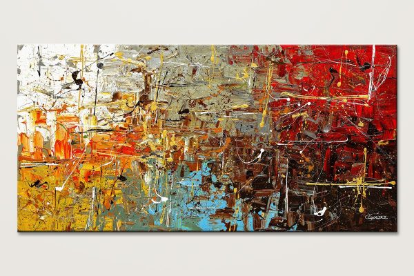
Safe and Sound – Modern Abstract Art
- Custom Order
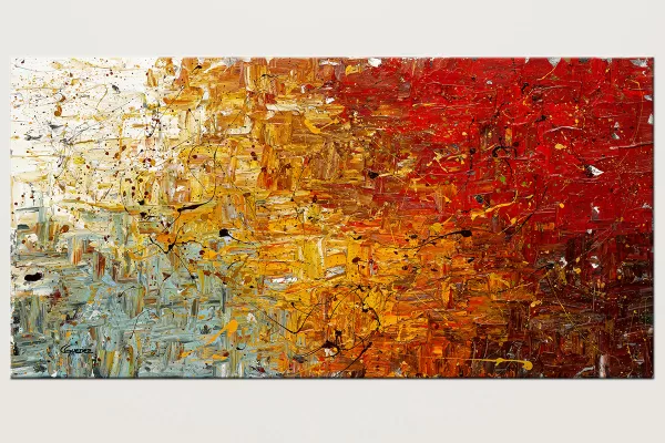
Running Free – Modern Abstract Art Painting
- Custom Order
Colorful abstract art is continuing to gain steam, thanks in large part to graphic design pushing rainbow motifs everywhere we look. It’s clear that the number of colors used in palettes is continuing to grow. It is not uncommon now to see promotional material with five or more featured colors.
This celebration of diversity in all its forms clearly underwrites this trend. The LGBTQ+ rainbow flag has become an ever-more-common feature of life in the city, and it was only a matter of time before designers began taking note and putting their own spin on the motif of a rainbow.
As that driver of the trend is not likely to go anywhere in 2021 — you can expect more colorful abstract paintings to appear on walls.
Décor in Transition
Design is about exploration, experimentation, and reflecting our personalities. So in 2021, we will continue to gravitate towards more color, visual interest, and playful design. — Beth Diana Smith from HomeGoods for Forbes
Décor has changed profoundly over the decades. Once upon a time, a few national magazines could more or less dictate the movement of trends. Today, there is no “one” style and no “one” last word on what is in and out.
Similarly, people buy abstract art in a much different way today. The proliferation of online art stores and ways to find and connect to artists has opened up a wide range of tastes.
Because of this, the exact color trends don’t matter quite like they used to. Of course, there will always be certain colors that appeal to the moment’s zeitgeist. But these are not monolithic anymore.
Still, color trends have an effect across many professional disciplines, and that makes ripples throughout many industries. For example, if interior designers begin purchasing a lot of yellow and grey décor, that will trigger more artists to produce work that matches those needs. Graphic design will feature these colors, alerting more and more people to their appeal.
The more these colors are picked up, the more likely they are to be repeated. HGTV renovation shows will feature them, magazines and online stores will start to provide more content in these trending colors.
It’s a snowball. The more these colors are used, the more other people see them and use them. That helps us stay in a conversation with each other.
BOTTOM LINE: Artists, interior designers, and other creatives are restless. They always have an eye out for new combinations and new ideas. That curiosity and creativity will lead to new color trends and new abstract art.
The Colors of 2021
As we’ve seen, grey and yellow are likely to be trendy over the next year. Classic black and white, blue, red, and rainbow palettes will remain prominent.
It’s important to remember that as people buy abstract canvas art today, they find a much friendlier and wide open field for them to shop. People buying work for their homes and offices are essentially free to follow whatever personal, specific tastes they might have.
That closes up a bit for business owners looking for that perfect oversized abstract art for their restaurant, bar, or hotel. These buyers still have to make sure that they bring the right feeling for the clientele they are looking to attract — but the tastes of that clientele are splintering off in a million different directions.
In some ways, this gives artists and interior designers more freedom than ever. That can be a good thing. But don’t we want color trends to constrict our freedom a bit? Don’t these guidelines give us some kind of constraint that we can create out of?
That’s a large part of what we want out of predictions for color trends: a way to limit our options and focus our attention. Not forever, just for a year. It’s a way for everyone to share an experience. “I remember that year, we were all wearing greys and yellows.” And that sense of unity is something many of us hope to see in 2021. Maybe color can play some role in that.
PLEASE SHARE THIS:

